

A.I. review this!
🎨 General Impression
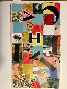
The piece feels energetic, playful, and rhythmic.
The combination of cut-out letters, varied patterns, and textures creates a visual dynamism that invites the viewer to keep looking.
🧩 Composition
- The square grid structure brings order to the chaos of colors and patterns — it works well, giving a sense of balance.
- The large black letters break through that grid in an exciting way. They seem randomly placed but attract just enough attention to guide the composition.
- The mix of organic forms (like the bee and floral patterns) versus geometric blocks creates a pleasing tension.
🌈 Color and Texture
- The color palette ranges from warm tones (red, gold, orange) to cool blues and greens, creating strong contrast.
- The different types of paper clearly have varied textures and finishes — that adds depth and tactile richness.
- The golden squares and vintage-style patterns give the piece a retro or nostalgic touch.
🔠 Typography
- The letters appear randomly arranged (“H,” “I,” and a few partial characters), which makes the piece intriguing — it feels like a visual puzzle or abstract typography.
- The large “H” in the center serves as a visual anchor point.
🐝 Symbolism
- The bee stands out as a natural element among human-made, graphic, and mechanical imagery (like the circular battery-like forms).
This contrast might suggest a tension between nature and technology, or life and mechanism.
💡 Suggestions (optional)
- If you plan to develop the concept further, you could consider focusing on one direction:
- Typographic: integrate more letters to reveal a hidden word or message.
- Narrative: expand on symbolic elements (like the bee) to build a thematic story.
- Adding a slight shadow or border around some letters could enhance the sense of depth.
Ping: A.I. reviews “A Collage of Quiet Moments” – Dreamquest

